Passion Gadgets: A Website Revamp
Context
Passion Gadgets is an e-commerce platform that specialises in bicycles. They carry a wide variety of foldable bicycles and caters to cyclists of varying experience levels.
Our team of 4 were tasked with revamping the existing Passion Gadgets website to improve their checkout rate. Passion Gadgets also requested an additional feature which allowed customers to narrow down bike options before their test ride session.
Summary
Duration: 3 Weeks
Team: 4 UX Designers inclusive of 1 Project Manager
Role: UX Designer (Focused on Usability Testing)
Skills: User Research, User Interface Design, Usability Testing
Tools: Figma
Results
Customers in our usability testing mentioned that the overall revamped website looks good.
“Navigation is better than the current website” - B

Additionally, we implemented 2 new features to the website, a bike finder quiz & a bike buyer’s guide, and improved the existing bike comparison tool
“Buyer’s Guide is good for first timers” - G
“I would be keen to use this quiz feature” - M
“Questionnaire is useful” - F
“The compare page looks pretty good” - B
“At one glance I can see the specs” - G
Problem
We identified 2 major problems after several visits and interviews with the staff and customers:
Customers have trouble navigating between the test centre & retail store and are unsure of which location they should visit first
Customers have to wait a significant amount of time before their test ride especially on weekends
Goals
Customer: Reduce the waiting time for a test ride and clarify differences between test centre & retail store.
Business: Streamline test ride and purchasing process by helping customers narrow down bike options.
Product: Improve the layout, navigation and mobile responsiveness of the existing website to be inline with contemporary design trends.
Understanding the Passion Gadgets Experience
We visited Passion Gadget’s physical store to meet with our client and get a better understanding of their business.
Staff Interviews

We conducted interviews with several employees to find out the challenges they faced and the common concerns that customers faced.
Field Study
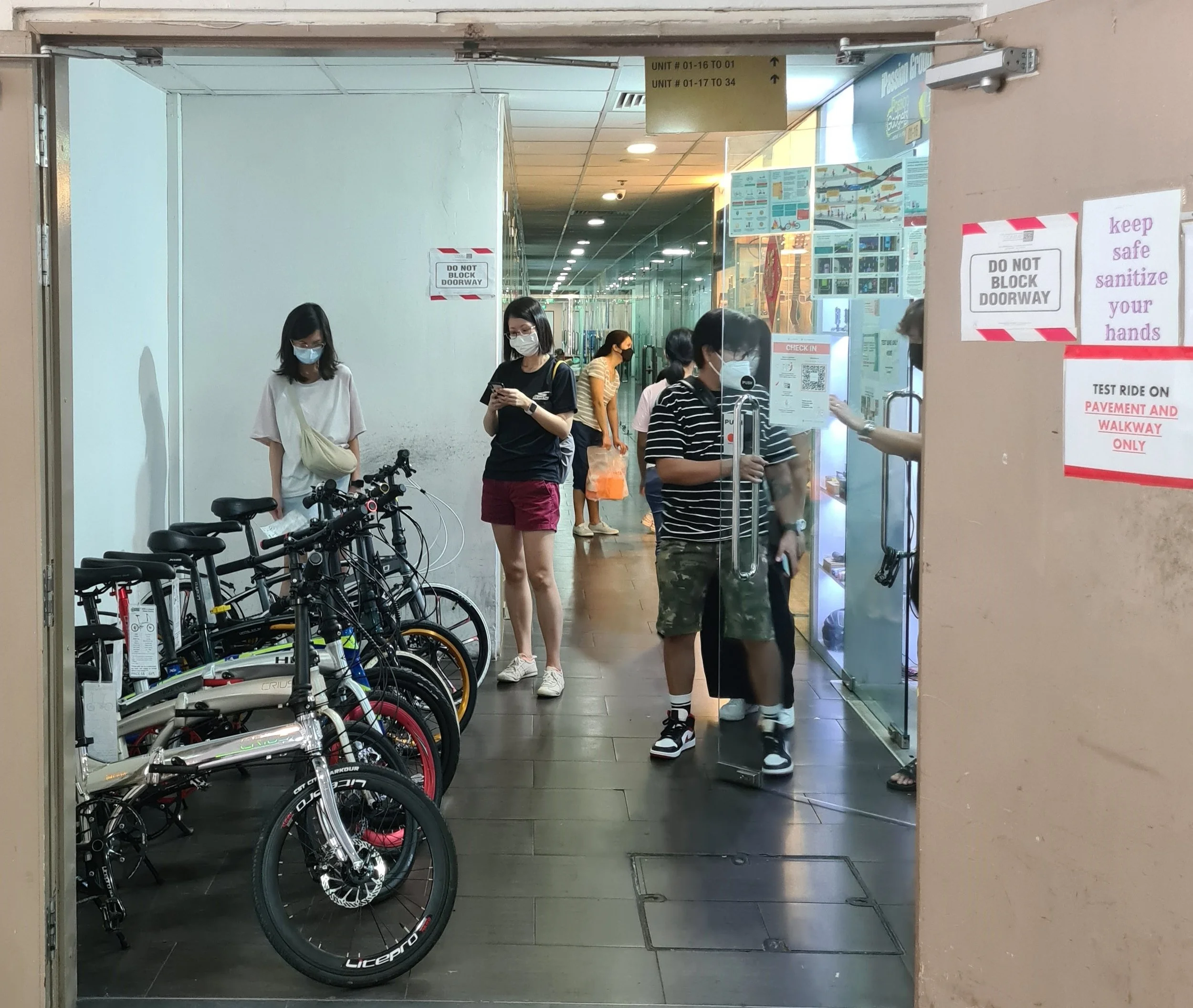
We also conducted field studies to observe customers’ behaviour and their interactions with the staff.
Key Insights
Main Types of Customers
First-time Bike Buyer

Does not have any bike purchasing experience
Seeks out recommendations and advice from staff
Wants an entry-level bike
Bargain Hunter

Wants the most value-for-money bike
Seeks out discounts and freebies to get the best deal
Compares bikes based on brands and specs
Has requirements for specific bike specs such as wheel size and speed
Long Wait Times
We observed several customers standing around waiting for their turn to test ride bikes at the test centre. As customers have to be accompanied by at least one staff member during the test ride, this results in a long wait time.
Furthermore, we discovered that a majority of the customers would walk-in for a test ride instead of making an appointment. This was confirmed by the staff who mentioned that there was a low usage of the appointment booking system.
Given that the crowd also becomes heavier on weekends, this causes a huge frustration for both the customers and the staff, which ultimately affects the business.
Confusion Over Test Centre & Retail Store
We also observed that several customers came to the wrong place - they intended to visit the test centre for a test ride but arrived at the retail store instead. These customers are usually first-time purchasers and were confused by what to do at each location.
Key Design Features
With the revamped website, we aimed to tackle the main challenge of long wait times by raising awareness and increasing usage of the appointment booking system. Successfully doing so would allow us to streamline the test ride and purchase process. This translates to increased efficiency for the business and reduced frustration from the customers and staff.
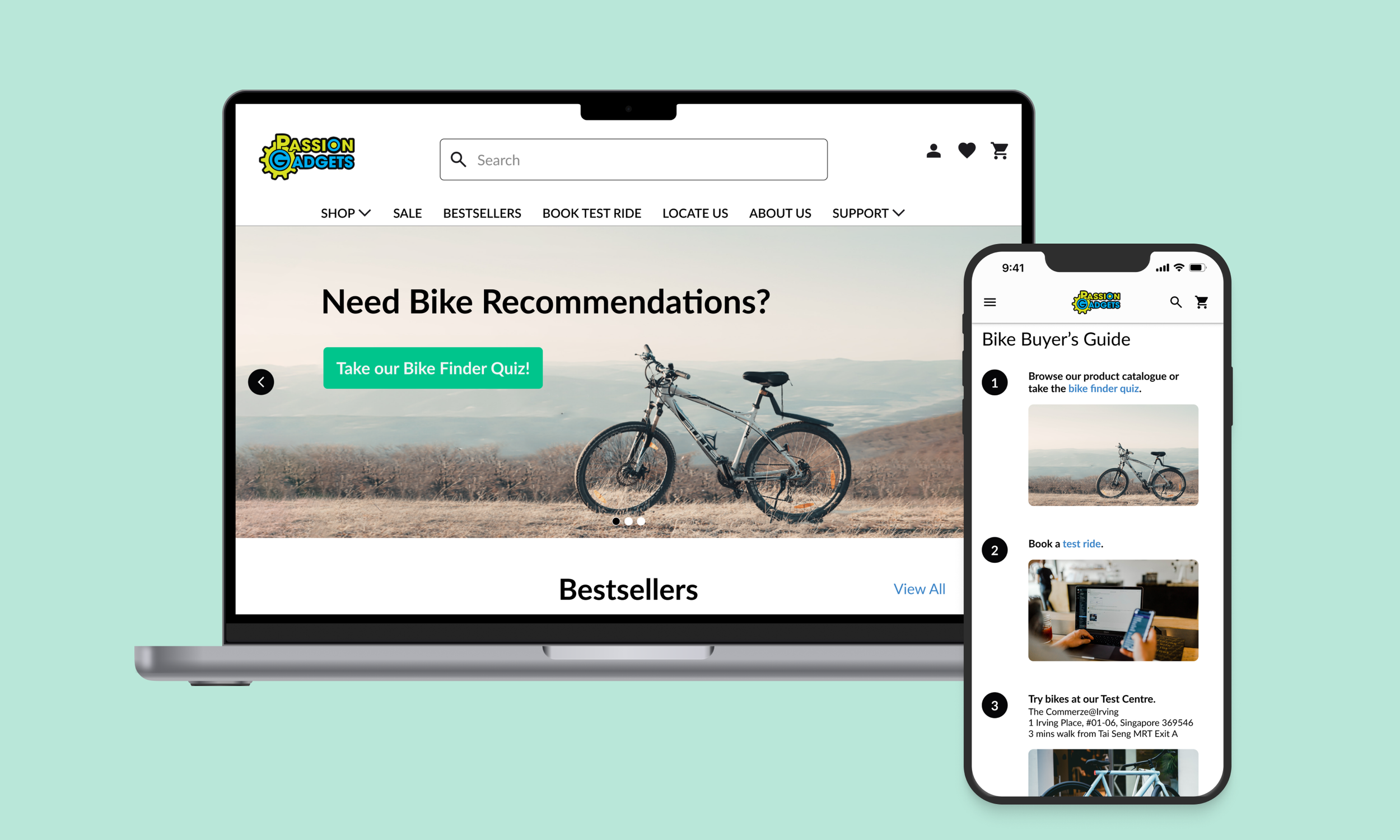
Declutter Navigation & Increase Salience
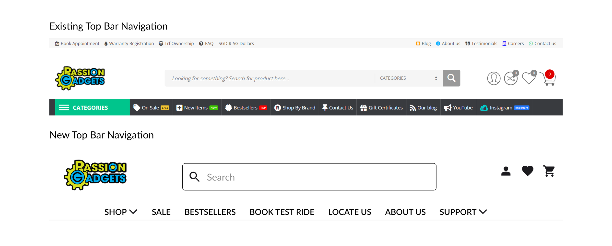
The first change we implemented was to condense the items in the existing navigation bars to one concise one.
The existing website had 3 different headers, each with its own unique items. It got more confusing in the website’s mobile version where each header had its own hamburger menu icon. Since one out of the numerous menu items was the call to action (CTA) to book an appointment, it was easily overlooked.
With the consolidated navigation bar, the book test ride CTA is more visible and clearly displayed.
Narrow Down Bike Options & Reduce Cognitive Load
We implemented 2 changes aimed towards helping customers make a more informed decision about the bikes they would like to test ride and/or purchase.
These changes strive to help customers filter down their choices so they would not be overwhelmed and there is less strain on their decision making capacity.
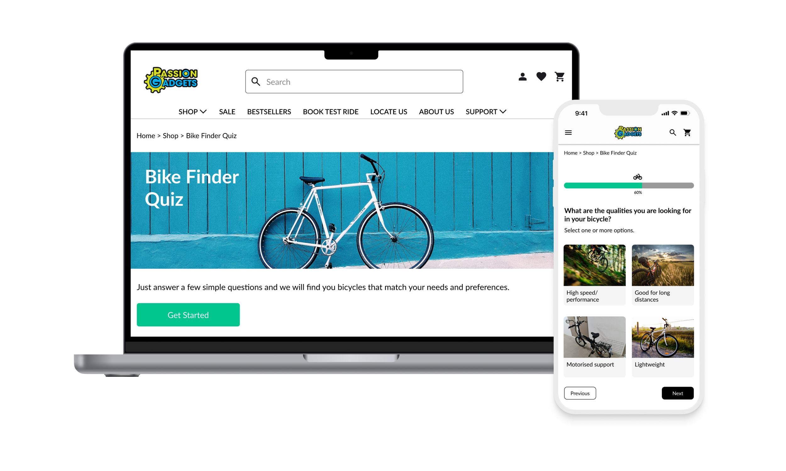
Quiz

We implemented a new Bike Finder Quiz feature to provide customers with bike recommendations based on their cycling habits, bike requirements and budget. This would cater to the first-time bike buyers, who are considered one of Passion Gadgets’ main clientele, by filtering down the number of bike options they would have to consider and help them make a decision without the need to rely on the staff’s advice.
More importantly, we included the book test ride CTA at the confirmation page of the quiz to direct more customers into making an appointment for their test ride.
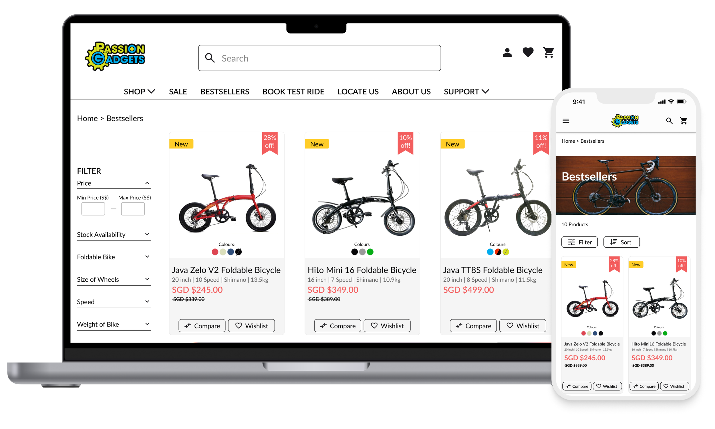
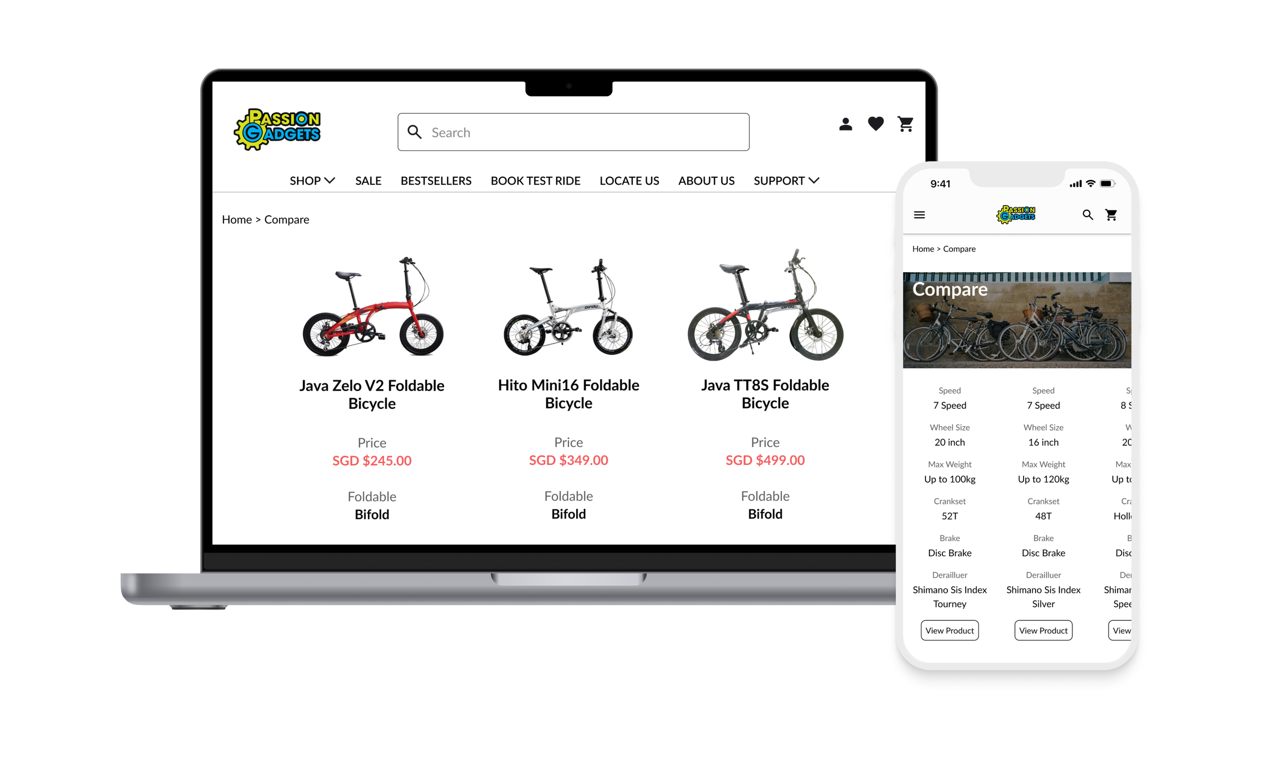
Comparison Tool
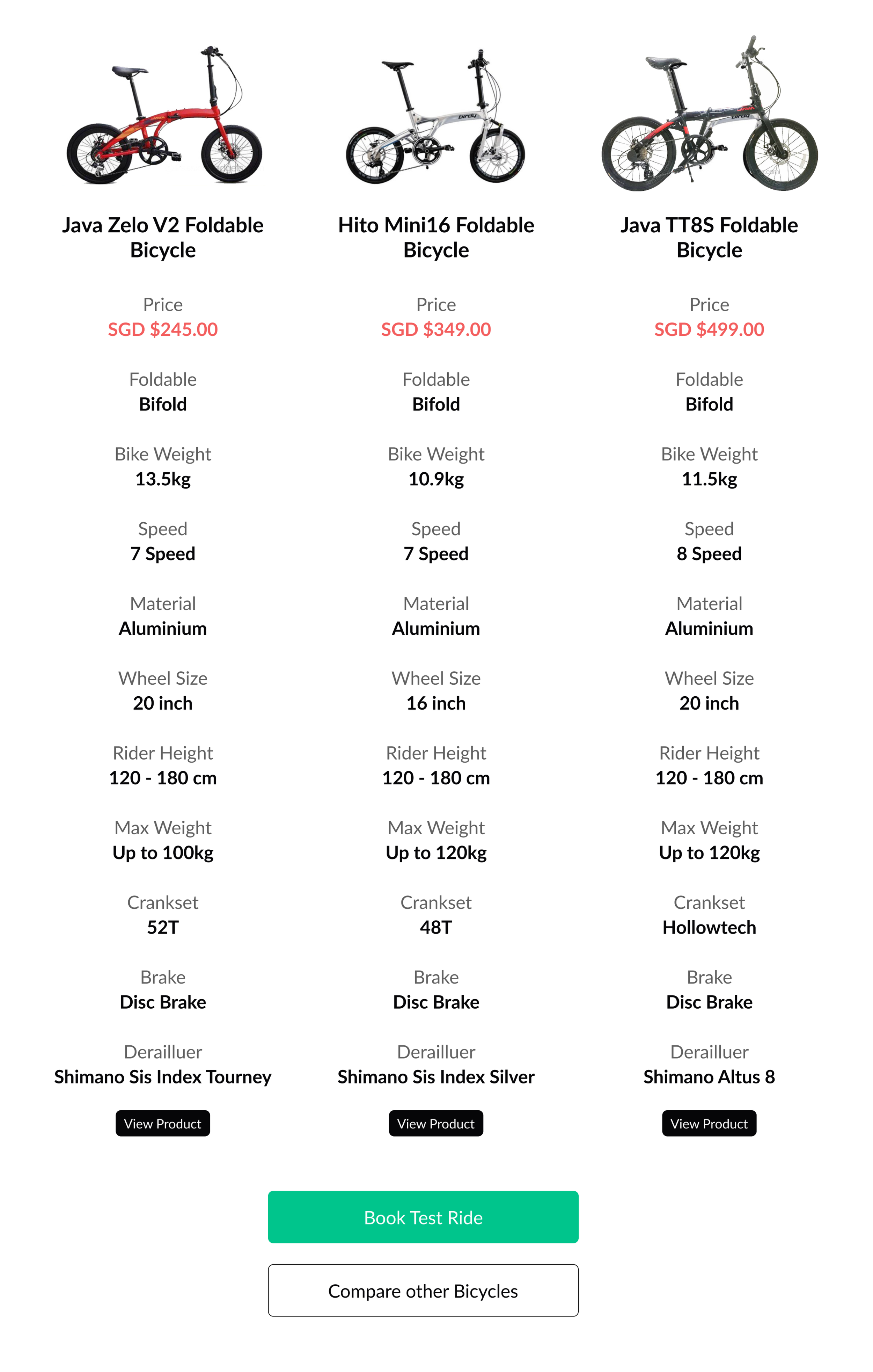
We also made changes to the existing comparison tool such that the compare CTA button is more visible.
The revised comparison page also includes a comparison table for important information that customers look out for such as price, brand and other more technical bike specs. This caters to the demands of the bargain hunters who would often make multiple comparisons before making a decision to purchase a bike.
Similarly, we also included the book test ride CTA at the revised comparison page so customers would pay more attention to it and use it to make an appointment for their test ride.
Book Test Ride Bike Selection
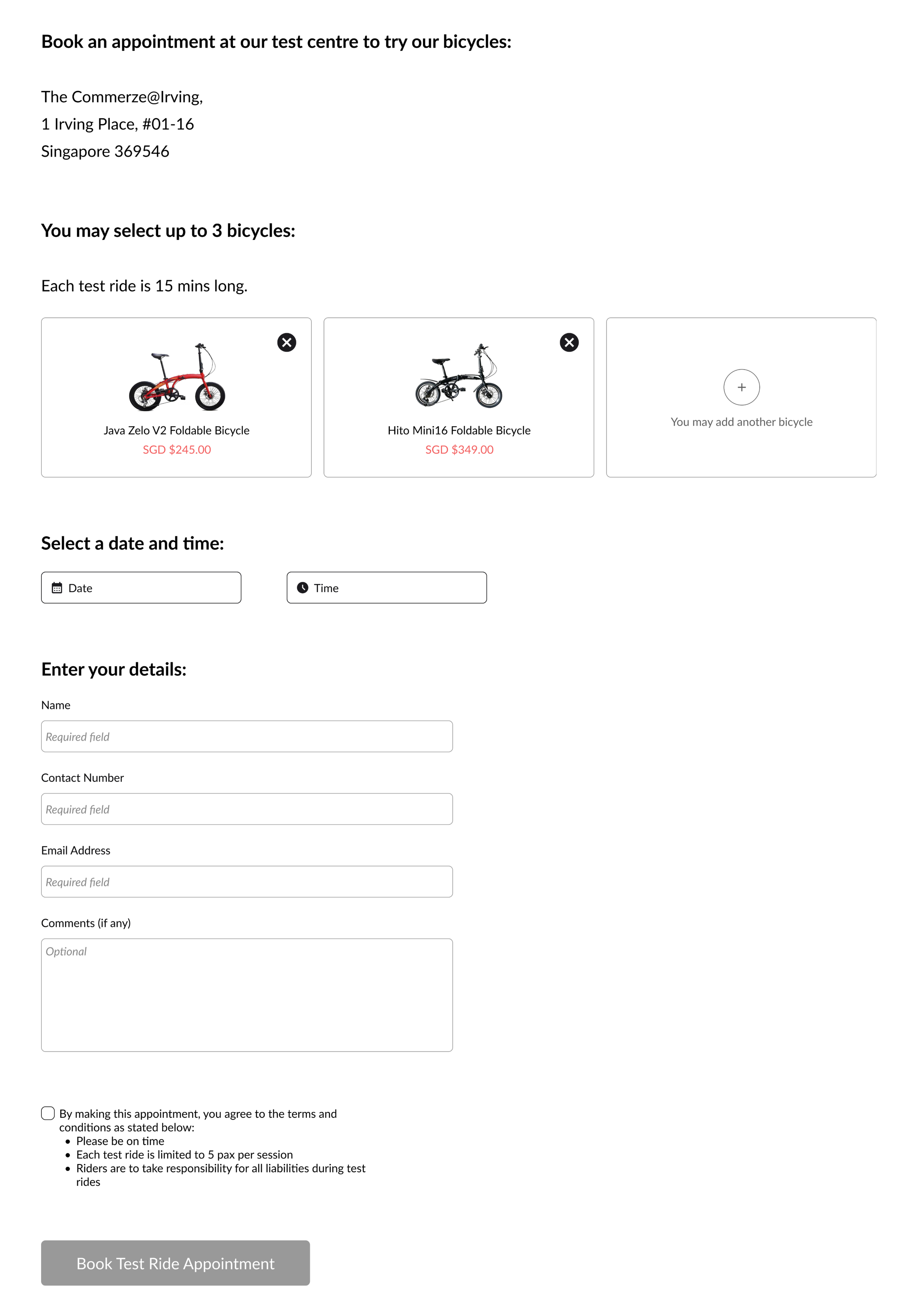
To integrate the recommendations and comparisons, we updated the book test ride feature to include a section on bike selection.
If the customer clicked on the book test ride CTA from the quiz confirmation or comparison page, their bike results would be auto-populated into the section.
This quality of life update would reduce the stress of having to browse through too many bike options and help the customer stay focused on only a few good choices.
Provide Clear Instructions & Reduce Confusion

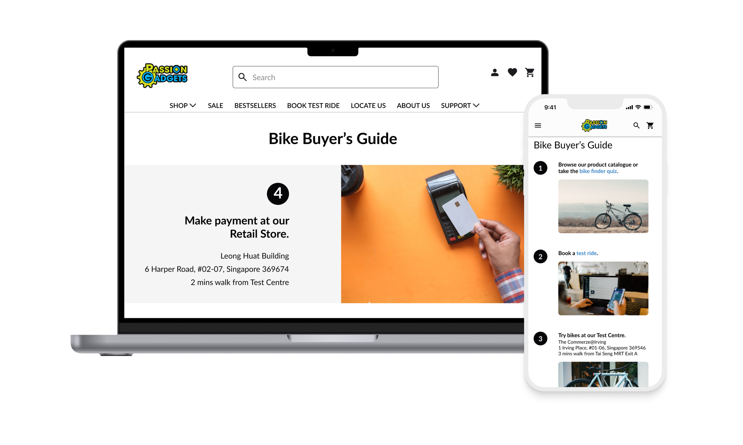
Lastly, we needed to clear up a common confusion that many customers faced - what is the difference between the test centre and the retail store?
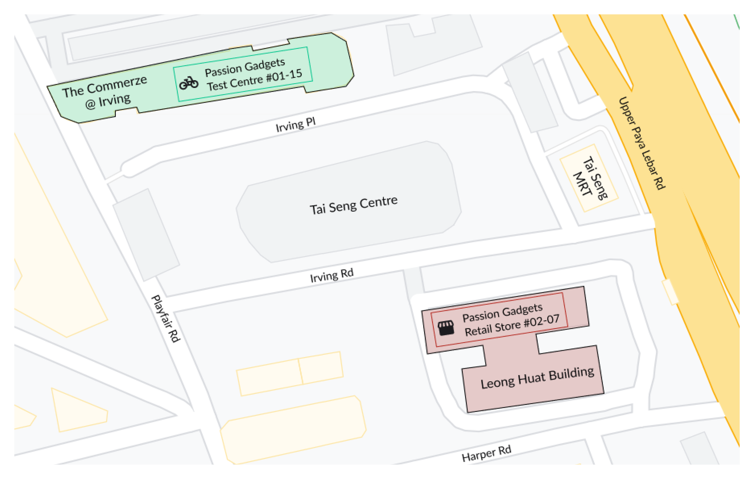
Our solution was to provide a bike buyer’s guide on the home page which detailed a typical customer’s bike purchase journey with Passion Gadgets in a series of steps.
This instructional guide provides clear actionable steps that customers could easily follow if they are unsure of where to begin. The guide also featured a detailed map outline of the 2 locations as well as key street names and landmarks in the vicinity.
Furthermore, this was an additional opportunity to incorporate the CTAs we aimed to highlight and direct more customers into using the Bike Finder Quiz and Book Test Ride features.
Usability Testing & Iterations


We made an interactive prototype with our proposed ideas and took it down to the Passion Gadgets store where we conducted 7 in-person usability tests to gather feedback from existing customers.
Based on their feedback, we implemented 3 changes to our website:
Iteration 1: Home Page Banner Visibility
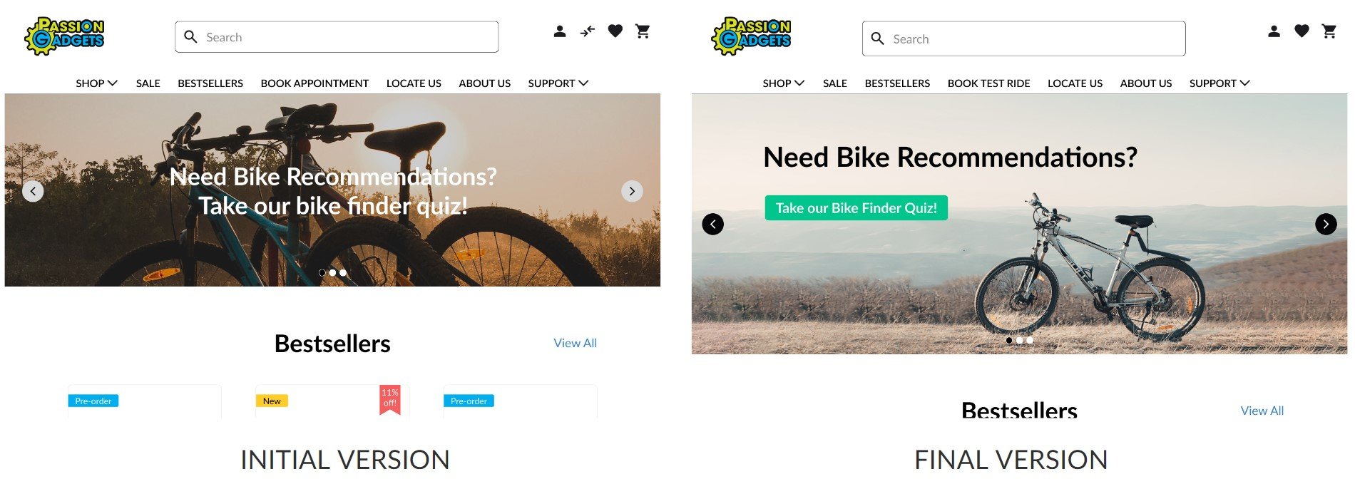
We observed that all 7 users did not click on the Bike Finder Quiz found on the homepage banner.
We increased the banner height and included a clear CTA button to direct users’ attention to the quiz.
Iteration 2: Bike Finder Quiz Questions
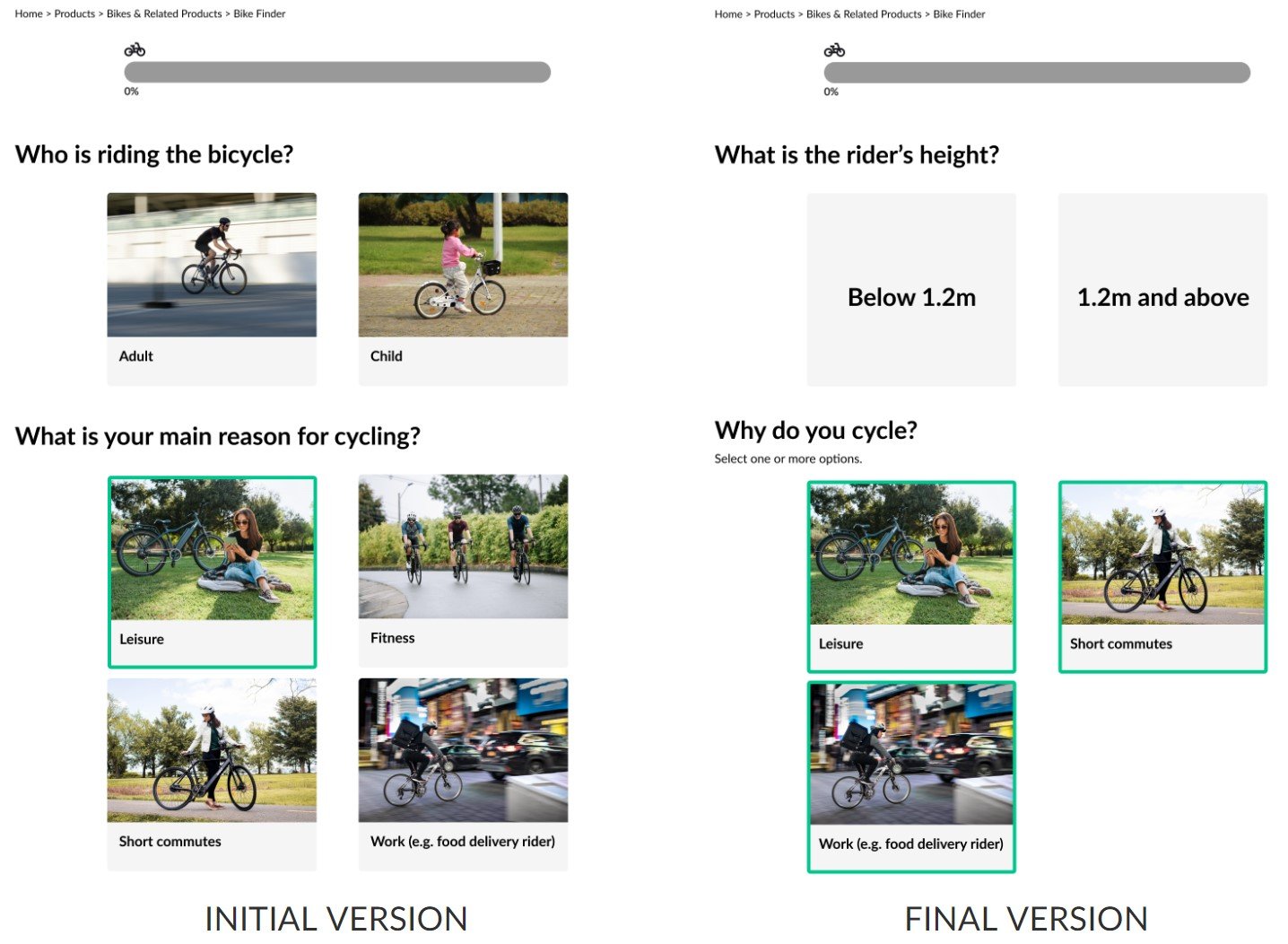
We made changes to 2 questions in the quiz to improve their accuracy.
We also enabled the selection of multiple options for one of the questions so it becomes more accessible and easier to answer.
Iteration 3: Comparison Page Bike Specs
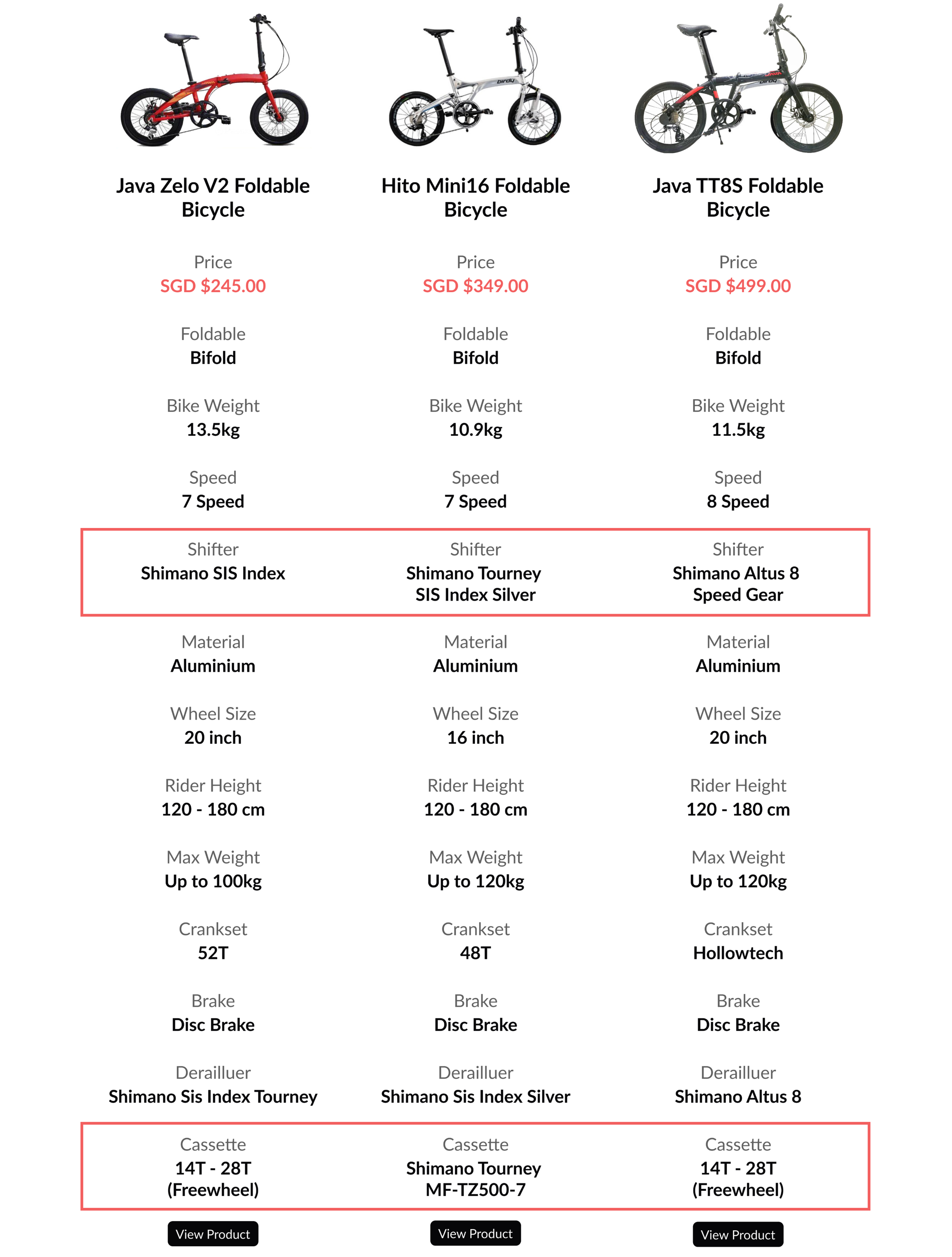
We included 2 important bike specs that were previously missing and were requested by the customers - shifter & casette.
Conclusion
Our strategy for tackling the main challenge of long wait times was to focus on increasing the usage of the book test ride feature.
With that focus in mind, we implemented 5 key changes to the website to increase awareness and visibility of this feature.
These new website features would be the first step towards facilitating improvements in the customer’s test ride and purchase journey.
More importantly, they also help us to reach the customer, business and product goals we set out to achieve.
Future Opportunities
Service Design
“Service design is the activity of planning and organizing business resources in order to directly improve the employee’s experience and indirectly, the customer’s experience.”
There are 3 core components for service design - people, props, and processes.
What we had done with the website revamp was one aspect of business props and served only as an initial point of the customer’s journey.
There are plenty of opportunities available involving the people and process which we did not have the time to engage with.
These are areas which Passion Gadgets as a company could address to further improvement the test ride and payment process for customers and employees.
Content Strategy
User experience is more than just the design of the website.
How the content is communicated and organised is essential for providing an exceptional user experience.
A holistic content strategy involves an organised process and structure for content management and well thought out content delivery that is aligned with the company’s personality.
The existing website content prioritises function over form, often having multiple pages filled with details.
Standardising the tone and voice of the content with a human touch would be another opportunity for improvement.