Esplanade&Me Membership App
UX Design Skills
User Research | User Flows | Wireframing | Design System | Prototyping | Usability Testing | Iteration
Context

THE ESPLANADE - A world-class performing & visual arts centre. Their vision is to be:
“An arts centre for everyone”
This means constantly striving to provide visitors with the best experience - both physical and digital.
Problem
The Esplanade’s website
Unfortunately, the existing website might not be sufficient in delivering the intended exceptional experience for the visitors.
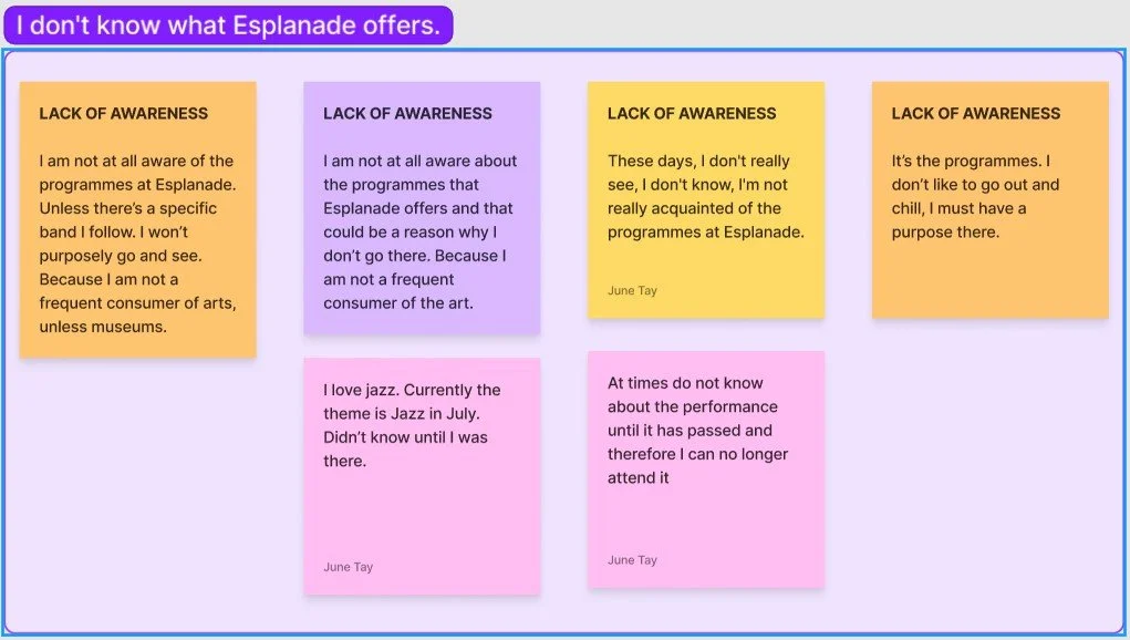
Our initial user research showed that 4 of the 9 users stated a general lack of awareness for the programs offered by the Esplanade, while 5 others cited friends or social media as their main source of information on the Esplanade’s offerings. This was concerning as it meant that people were not visiting the website even though it is the Esplanade’s main digital platform.
We also analyzed the website and found that the navigation and organisation of all the Esplanade’s various programs was not very intuitive and could be clearer. This was supported by further user research, where interviews were conducted to gather feedback on users’ current browsing, purchasing, and ticketing experience with the website.
Esplanade&Me Membership Program
We also asked our users about their knowledge of the Esplanade’s membership program - Esplanade&Me. Our users mentioned that they either did not know there was a membership program or that they vaguely knew one existed but did not know what that entailed.
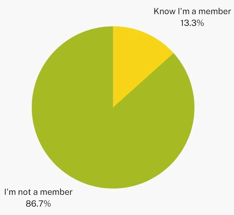
Interestingly, we discovered that users’ Esplanade&Me account is tied to their SISTIC ticketing account, which must be created before purchasing any tickets from the Esplanade’s website. This meant that if a user had purchased tickets on the Esplanade’s website, they would have signed up for an account and would be an Esplanade member. This was surprising to not only us, but our users too!
Out of the 13 users who had purchased tickets via the Esplanade’s website, 86.7% of them surprisingly did not know that they were existing members.
Solution
Why Focus on Membership?
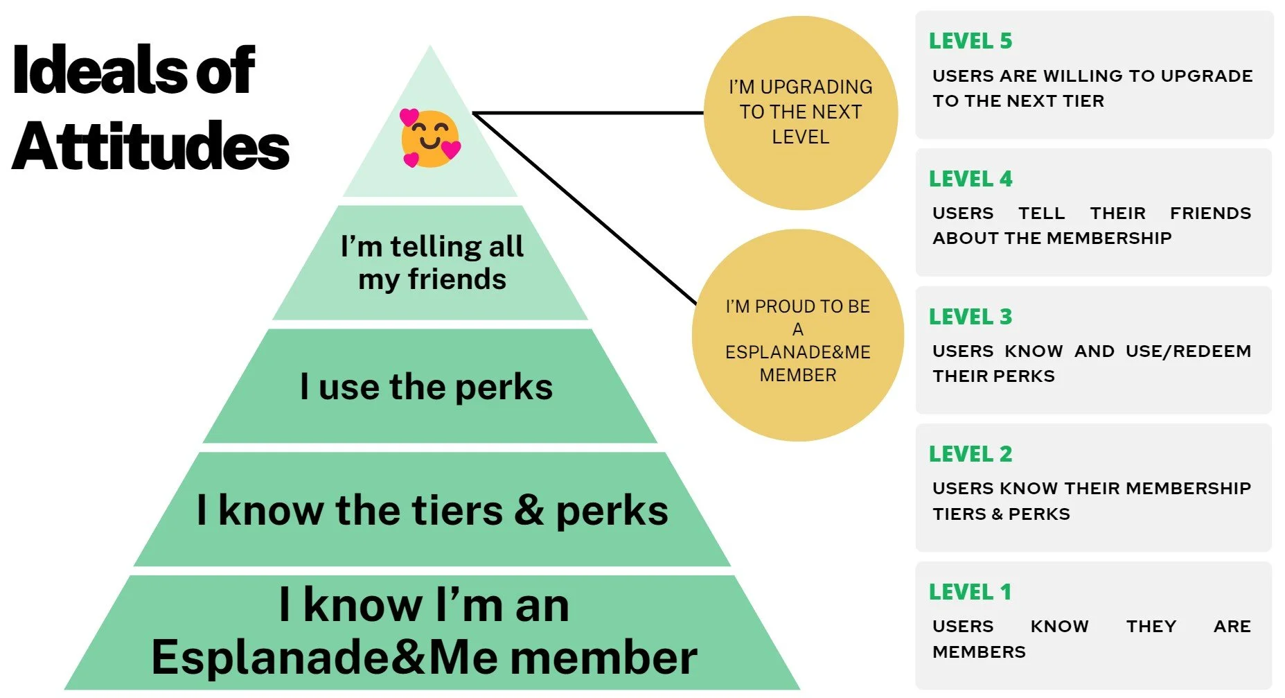
With such shocking survey results, we knew we had to focus on changing users’ attitudes towards the Esplanade&Me membership program. Currently, users are indifferent towards becoming a member because they do not see the value in the membership program.
What we want to do is to convert these attitudes into positive ones, such that they become proud Esplanade&Me members in the future.
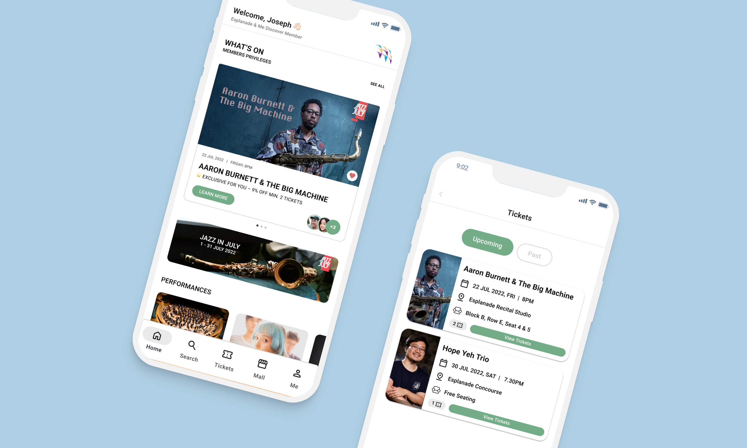
Why a Mobile App?
After our ideation, we came to the realization that an interactive mobile membership app would be the best way forward:
By definition of being a membership app, it makes the Esplanade&Me membership program known from the start and offers additional benefits for members such as personalization of recommended programs
The app will offer a more intuitive search and filter system with clear and understandable labels to address our users’ pain points with the navigation & organisation of the website
The app will also include features to enhance the purchasing and ticketing experience of users
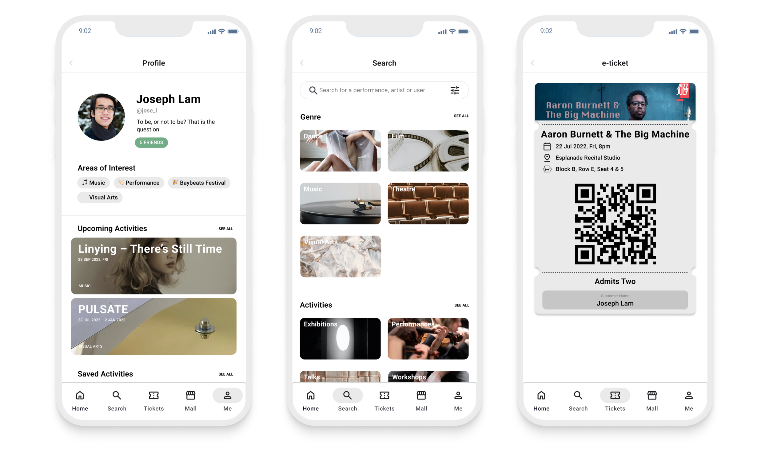
Usability Testing
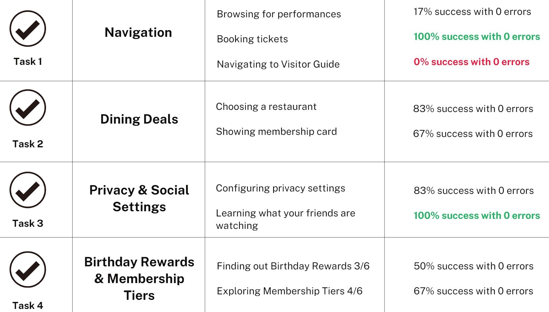
We conducted a usability testing with a total of 6 users. There were a total of 9 individual tasks grouped into 4 major tasks. We analyzed how many errors our users made when clicking through the prototype to determine the success rate.
We found that for 2 of the tasks, booking tickets & learning what your friends are watching, all 6 of our users were able to successfully complete the tasks without errors.
For one of the task, navigating to the visitor guide, all of our users were unable to complete the task without errors!
We also asked several post-test questions to get general feedback from our test-users.
Iterations
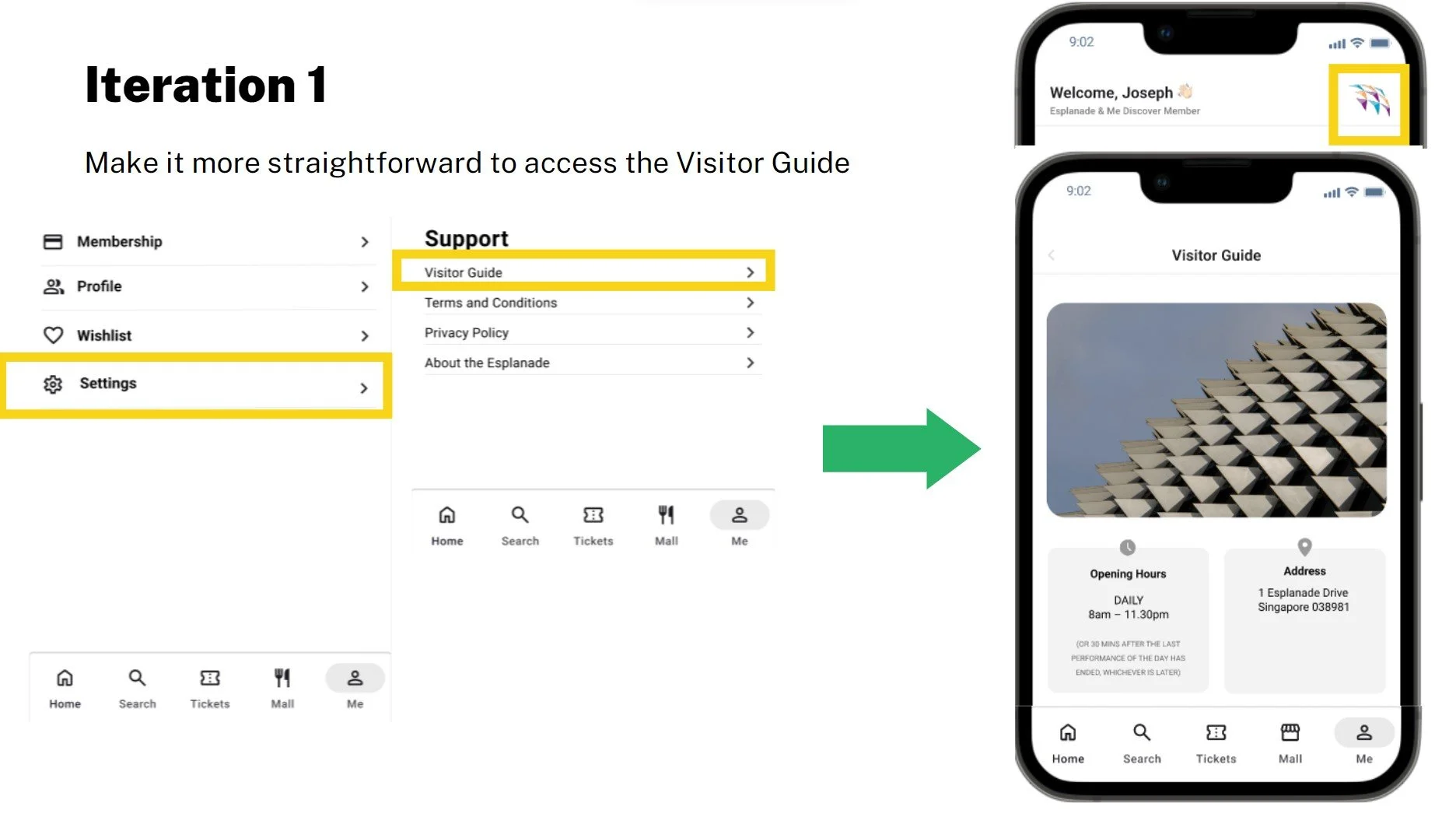
For the visitor guide, it was previously nested within the settings section of the me page. Our users were unable to find it and tried to click on the Esplanade logo at the home page instead. Hence, we decided to link the visitor guide to the logo and make it a clickable button.
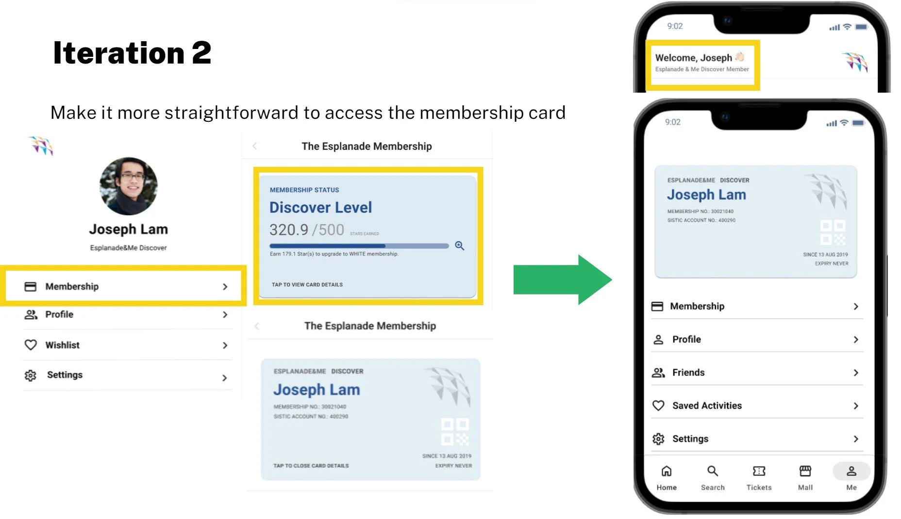
For access to the membership card, it was previously nested behind membership. We made it such that our users could click on the welcome sign on the home page to access their membership card. We also made their membership card more directly visible on the me page.
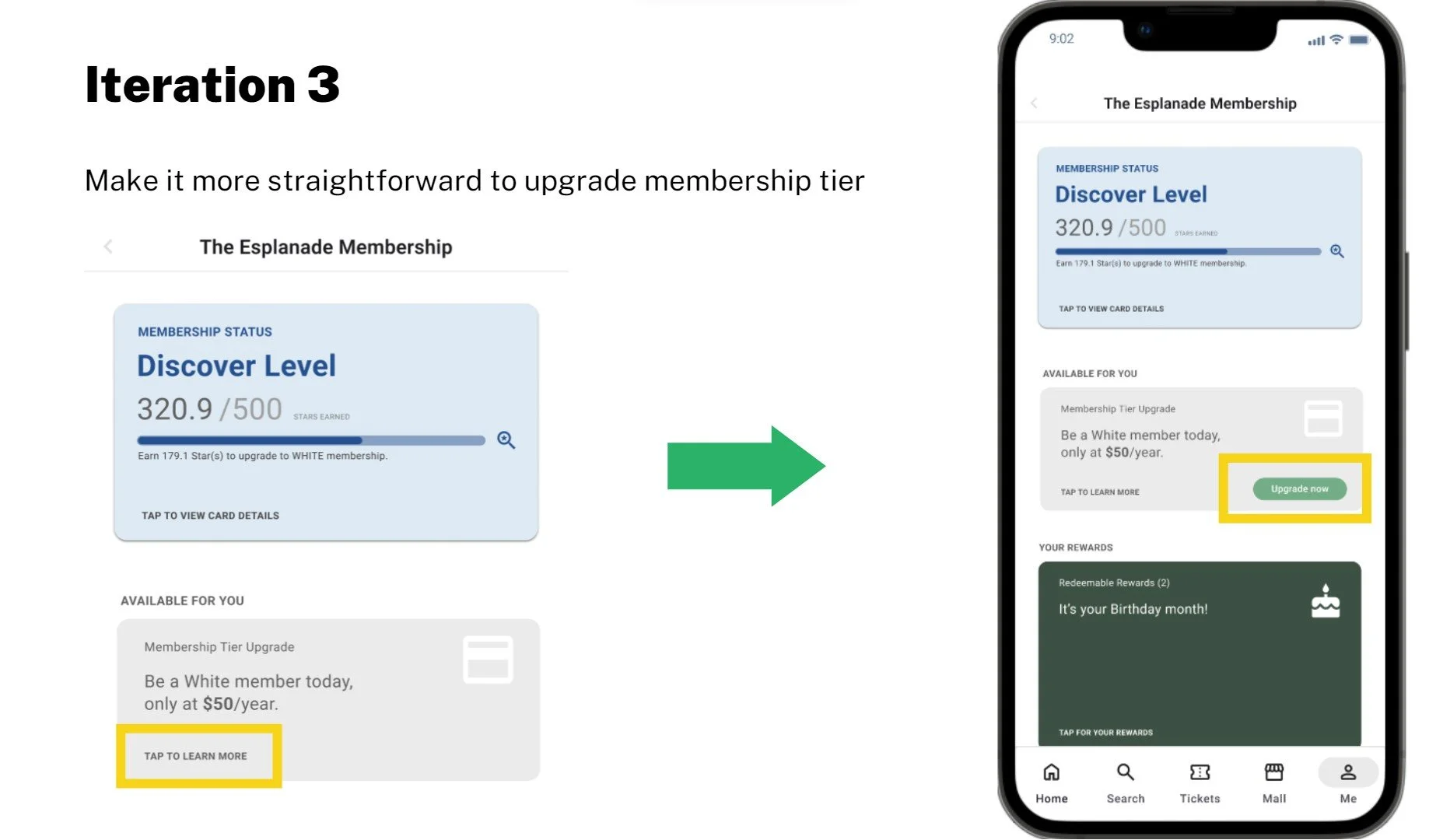
We also realized we wanted to make it more visible and direct to upgrade their membership tiers so users can easily see the call-to-action of upgrading their membership.